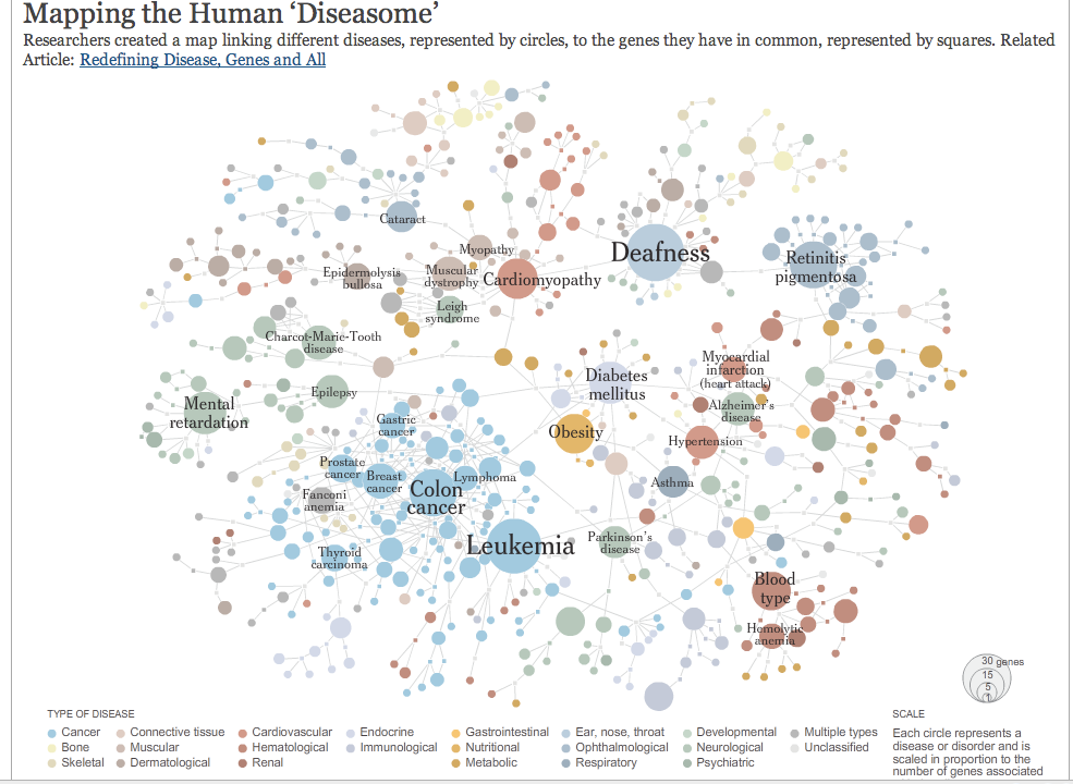
An amazing map of human diseases, sorted by genes that certain diseases share.
Thursday, June 5, 2008
Another Awesome NY Times Chart
Subscribe to:
Post Comments (Atom)

An amazing map of human diseases, sorted by genes that certain diseases share.

I don't get it really, but my dad and brother are doctors and I forwarded it to them.
ReplyDeleteYeah, it's pretty complicated...I'm not a doctor either, but they manage to make this info both interesting and intuitive to look at, which really impresses me. Thanks for posting!
ReplyDelete