

I noticed this storefront yesterday, and was amused by the choice of font for the name of the restaurant. While I agree with the choice of avoiding the obvious Chinese novelty font, using a Celtic novelty font doesn't really seem like the most appropriate choice....
Dockers has plastered the city of San Francisco with its new ad campaign, which consists of urging men to be men and "Wear the pants." When I saw this ad, however, I initially thought I was reading Vietnamese (really: "Diem" is a common Vietnamese word). I think that Dockers has realized the pun in this ad is a little too obtuse for the general public, because most of the bus posters featuring the line have disappeared.
Keep reading...
Thursday, December 31, 2009
San Fran Stuff
Tuesday, December 29, 2009
Why can't we all just get along?

Living in a city exposes you to all kinds of crazy scenes and situations that can entertain, shock, or pain you, depending on your point of view.
In the past two weeks I’ve witnessed three fights at a club (all in one night), a woman having a seizure on the sidewalk, a man yelling at and attacking a metal sign outside a cafe, and an unfortunate, movie-like altercation at the post office yesterday. A woman was trying to mail a package, but the clerk said the ZIP code on the package was invalid. The woman insisted it was correct, and became increasingly agitated when the man refused to accept the parcel.
Her protests grew more shrill, as she first contended that a man would get better treatment, and then, being ignored by the clerk, wailed “What is wrong with you people!”
Yes, the clerk, and his coworker, were black.
Several people in the long line ooohed, and I knew what was coming next.
“What do you mean, you people?” the second clerk asked. But the delay of his response, as well as his tone, made this reaction sound almost perfunctory, as if he was just saying it because people (those in line, society, et al) expected it.
Fortunately it did not escalate from there, as a supervisor came out to help the woman. Still, I couldn’t help but shake my head. That line has become such a cliche, beaten into our heads in movies like Tropic Thunder, that people drag race into disputes in which it really plays no role.
This woman, living in the most liberal city in America, likely an Obama voter and one-time hippie, almost certainly was not making a statement about black people with her comment. Yet the man felt obliged to make that boilerplate retort, as if the two were playing out a scene in front of the line.
At this point it’s probably impossible to separate the “you people” expression from its racial connotations, but it’s a shame the two ever became so intertwined in the first place. Although racism is surely still a problem--especially the subtle, suspicious-of-Others kind--comments like these should not be taken as racist.
Given what came before the phrase in question, it is more likely she felt mistreated as a woman, not a white person. And given the long history of difficulties with gender relations, that is an issue that will be much harder to solve.
Keep reading...
Thursday, December 10, 2009
Interesting Stuff the Web Showed Me This Week
I've spent an unhealthy amount of time browsing the internet this week. These are some things that caught my eye:
I'm not the first to notice how ridiculous Facebook's suggestions are getting. But now it seems they're upping the ante even more, by showing how active your friends are on Facebook. Here, it says one of my friends is only 5% active, whatever that means. Clearly it's a bad thing, in FB's opinion. But I say good for them! I for one am not going to encourage any of my disinterested friends to give almighty Facebook more of their time. Don't start frittering your life away on social networking sites. Stay away. 
When I searched for "perk" on Dictionary.com, a banner ad for a credit card appeared above. Coincidence or clever media buy? Who knows. But it's given me some ideas, either way....
Google announced the integration of real-time search this week, which can be accessed in one of two ways. Inputting your search term + "twitter" sometimes returns a dynamic twitter feed at the top of the results, but only for some search terms. The more reliable method is to click "Latest Results" in the Show Options column in your search results. Pretty cool.
Keep reading...
Monday, November 16, 2009
Soon The Moon Will Rise at Noon

English is beloved by language lovers everywhere for its lexical richness, a result of its heritage as an amalgam of both Romance and Germanic words. It may not have the elan of French or the gusto of Italian, but no language compares to English in terms of the depth of its vocabulary.
Like other Indo-European languages, English relies on a large supply of prefixes, suffixes, and other units of speech to convey meaning. Most suffixes are quite flexible, and are used by English speakers to coin new words (think Kafkaesque, doable). This makes English almost infinitely expandable, and enables anyone to contribute neologisms to the lexicon.
My topic of discussion today is one suffix in particular: "-oon."
Oon may be my favorite suffix, as its appendage makes any word instantly more fun. What's more exciting, a bar or a saloon? Who would you rather meet, a magnate or a tycoon? Which is a better insult, idiot or buffoon? (The list goes on--bass vs. bassoon, storm/monsoon, etc.) And who doesn't like cartoons?
Oon words are fun on the tongue (or, more precisely, the lips) and also fun to write. I remember the first time I learned about the people known as Walloons who live on the border of Belgium and France. What a fantastic name, I thought! I think I imagined Walloons as jolly, playful people, possibly combining the concepts of "walrus" and "balloon" in my head.
Today my enjoyment of the suffix is no less, and I look forward to English adding more oony words in the years to come.
Keep reading...
Saturday, November 14, 2009
How to Solve America's Obesity Problem

Simple: Ban free bottomless tortilla chips at Mexican restaurants.
I'm only half kidding. Those chips--always the same fried yellow triangles, whether you're in Atlanta or Olympia--are the single biggest threat to American diets today. In the kitchens of "Mexican" restaurants across the country, tortilla chips are stored in huge trash cans (seriously), and dispatched in heaping piles to new tables as soon as they're seated. Before water or waiter, there is a mound of crispy, greasy, addictive chips begging to be devoured. These chips contain hundreds of calories and plenty of stealth fat, all consumed before even touching the meal one has paid for.
No matter what size the party is, the portion is the same. That means a table of two will share the equivalent of over half a bag of store-bought chips, except the ones they serve in a restaurant are even less nutritious. Many grocery store chips these days have added whole grains and fiber, and may even be baked. Restaurant chips, however, are merely fried corn pulp, produced in massive quantities by factories probably working around the clock to sate our appetite for endless chips.
America was the first, and may remain the only, country to "enjoy" this perk in its Mexican establishments. Do real Mexicans nomnomnom on infinite chips with every meal? Of course not! They're too busy eating delicious tacos, flautas, gorditas, and other incredible authentic dishes to bother with silly chips. Other restaurants that offer complimentary preprandial snacks typically provide a basket of bread slices, and perhaps some pats of butter. This is a much more effective and healthy choice, as it satisfies the pre-meal borborygmus (my apologies for the two 50-cent words--I owe you a dollar) without being dangerously addictive.
Some governments--most notably that of New York City--have attempted to curb obesity by requiring restaurants to post calorie counts for the items on their menu. This has proven surprisingly ineffective, as pointed out in a recent Op-Ed in the New York Times. If people cannot be counted on to eat their tortilla chips with discipline, a limit should be imposed. Something akin to lashing Odysseus to the mast of his ship--a voluntary restriction of chip intake via some sort of emergency button to prevent continuous refills.
Obesity is probably the most serious and costly health issue facing America today. Many fatal diseases--too many to list--have been tied to this relatively preventable condition. So let's all agree to take an easy step towards dietary health, and say adios to the bottomless chip basket.
Keep reading...
Thursday, October 8, 2009
The Crux of Creativity
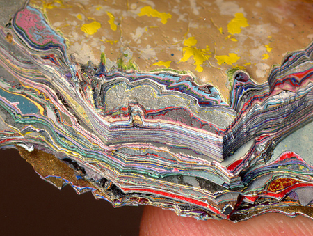
Philosophers and neuroscientists have debated the essence of aesthetics from many angles—its evolutionary origins and psychological framework being two of the more popular. Yet there is one common tie among all productions that are pleasing to the senses that is most crucial to understanding why we enjoy them. Every exceptional creative work, be it fine art or part of pop culture, relies on a fundamental concept for its success: layers.
Layers are the fabric (literally, sometimes) of creativity. A painter uses layers of paint to build rich color and texture on a canvas. A graphic designer uses layers to add dimension and dynamism to a flat surface. A writer uses layers to construct a rich and compelling passage of text. A sound mixer uses layers to develop a melody that is strikingly new and catchy at the same time. A film editor uses layers to combine sounds and visuals in an emotionally-arresting way. And fashion designers use layers to create eyecatching ensembles, one color and texture at a time.
Complexity gives the mind something it can’t dismiss with a glance. When a work of art, an outfit, or a beat is too simple, it is easily ignored. But start adding levels of meaning or physical depth, and the piece becomes something to be studied. The best creative pieces can be enjoyed on multiple levels—appreciated by a novice and pored over by an expert. In short, layers make life interesting.
Keep reading...
Monday, October 5, 2009
The Retail Brain Drain

Several years ago a list was circulated online, mostly through the Facebook grapevine, that enumerated the experiences and cultural hallmarks shared by American kids growing up in the ‘90s. From Captain Planet to slap bracelets, the list was quite thorough. There was, however, one unfortunate omission: the educational toy store.
The mid-‘90s were the heyday of the educational toy store—fantastic houses of knowledge like Learningsmith, Zany Brainy, and The Nature Company. Selling all manner of intriguing objects and playthings, each one presented a welcoming environment to while away an hour or an afternoon, exploring the store and, by extension, the world.
Existing for the most part in the pre-internet age, these stores thrived by captivating the imagination of children (and, to be sure, their parents as well). The Nature Company offered drawers of fascinating fossils and rocks, Learningsmith stocked an ever-changing variety of irresistible games and puzzles, and Zany Brainy had dozens of toys available to try out for free. Each was a paragon of merging children’s interests with their parents, and a paradise of educational fun. Kids came on weekends to check out the newest Lego sets, magnetic wonders, and colorful board games, and parents could take comfort in the fact that these diversions were beneficial to their children's intellectual devleopment.
But times have changed. Technology has triumphed over toys, though not exclusively to the detriment of today’s youth. Information is accessible as never before, making memorization of facts largely obsolete. And while it seems sane to mourn the loss of real, in-mind knowledge, the way we interact with information 50 years from now may make this headshaking and in-my-daying seem shortsighted. As more and more information is digitally indexed, and consequently made easier to search, analyze, and cross-reference, less value will be placed upon an individual’s ability to summon facts from memory, and more emphasis placed upon his capacity to synthesize concepts and draw inferences from them.
Keep reading...
Monday, September 21, 2009
Punctuation Perplexity

How to punctuate interpersonal communication is a perpetual quandary for me. Though our alphabet offers quite a few marvelous marks (my favorite being the em dash), they tend to fall short in many common everyday situations.
Take courtship. When writing to a prospective paramour, one must pay attention to the smallest details. Not only the words, but also the punctuation marks between them, contribute to the substance of the overall message. For example, say you want to tell someone how great it was to meet them last night. Should you write:
It was great to meet you last night.
or
It was great to meet you last night!
The first sounds sterile and nonchalant, while the second comes across as overly enthusiastic and aggressive. Since the advent of the digital age, however, people have taken to creating new symbols (emoticons) to fill the semantic gaps. So we have a third option:
It was great to meet you last night : )
This smiley communicates the necessary flirtatiousness, without being too over-the-top. Professional emails may also be subject to this tonal ambiguity.
Thanks for taking the time to speak with me yesterday.
Thanks for taking the time to speak with me yesterday!
While the first sounds objective and slightly sterile, the second may come across as unctuous. After agonizing over this decision many times, I finally came up with a solution: the ellipsis.
Thanks for taking the time to speak with me yesterday...I hope to hear back from you soon!
In this case, the exclamation point feels less forced, since it is now emphasizing two points, connected by those three helpful dots. An ellipsis comes in handy in all kinds of situations, and has become my go-to punctuation when none others seem to do. In fact, I recently met someone whose ellipsis-affinity is even stronger than mine. All of his text messages use ellipses as substitutes or add-ons for other punctuation marks (On way... Good deal...K... OMG....!!! Really...???). As an ellipsis lover, I felt true kinship with this person.
There are many marks that are rarely seen, but fill in important gaps in the usual punctuation bank. The interrobang (‽), for example, combines a question mark and exclamation point, and would likely be used extensively were it included on keyboards. Personally, I've always found there to be an excess of symmetric enclosures--{}[]()<> on keyboards, some of which could surely be relegated to the "symbols" box for their occasional use, freeing up valuable keyboard space.
As language continues to evolve, people will surely find new uses for existing marks and perhaps create new ones. In fact, the first mark used to separate sentences was the interpunct ( · ), common in Ancient Latin texts. Who knows what linguistic transformations will take place over the coming years to affect punctuation. (Should I end that with a period or a question mark? Hmmmmm...)
Keep reading...
Sunday, July 12, 2009
Really?
To be sure, the internet is filled with countless headscratching headlines and pictures, documented diligently by the billions of eyes and ears that inhabit the web on a daily basis.
Here are two tidbits I've found the past couple days, both of which had me shaking my head in amazement. 
The first is the bottom headline on Yahoo's news feed. There are certain Paris Hilton news items that could conceivably qualify as news. She gets married, has a baby, or dies. That's about it. Waving at a judge? Is that really one of the five most important news stories at 7:33pm EST? I highly doubt it. 
The second is from a Microsoft help page about a missing codec. It offers a helpful suggestion, saying the codec I need may be available to download from the Internet! Really? That's fantastic! I just go to the Internet and get my codec? Do I need to use AOL to do this or will Altavista work? Thanks, Microsoft!
Keep reading...
Tuesday, June 16, 2009
Babies Are Funny

We are in a Golden Age of baby-based humor. The mere appearance of baby is enough to elicit a smile from all but the most cold-hearted of adults, so put a baby on screen and you’re halfway to a laugh. Babies are wide-eyed innocents, perfect patsies for our childish pranks and perversions.
Perhaps the epitome of the current enthusiasm for exploiting infants for laughs can be found in The Hangover, the number one movie at the box office for two weeks running.
Although I generally found the movie unfunny and unimaginative, the scene in which Zach Galafianakis manipulates the baby’s arm to suggest a certain private male act had me cracking up even after leaving the theater. This juxtaposition of complete innocence and crude vulgarity is a recipe for comedy gold.
For a more toned down version of this, refer to the famous “E-Trade Baby” commercials, which first aired during the Super Bowl. Few commercials are as widely liked as those featuring this savvy toddler, with the slurred, nasal voice of a 30-something hipster. Again, combining the baby’s natural movements and expressions with sharp, sophisticated dialogue ¬has very humorous results.
But this is just the tip of the iceberg. Beyond Hollywood and Madison Avenue, on the unlimited expanses of the internet, one finds countless examples of cute babies turned into comedic showpieces. The #4 most-viewed video ever on You-Tube is Charlie Bit My Finger, featuring two brothers, one of whom, you guessed it, bites the other. There are also several popular videos of babies laughing. Hahaha is #11 all-time, and The Evil Look and its many copies have tens of millions of views. Another, “Blood,” shows a concerned toddler pointing out blood to his parents, and growing increasingly frustrated with their unexpected reaction.
Anther popular internet meme is the Funny Photoshopped Baby Face, which is simple a picture of an evil-looking baby who has been digitally given all sorts of costumes, from Hitler to Shrek.
Parents have always been entertained by their adorable offspring, but it is only recently they have gotten the chance to share these moments with the world. As long as they remain cute and helpless, babies will continue to be playthings for grown-ups. I only hope that people do not abuse their power, but allow society’s only unadulterated members to enjoy their precious pre-conscious years in peace.
Keep reading...
Friday, June 12, 2009
My First FAIL Pic

The popular YouTube star Nigahiga recently made a commercial to promote Carl's Jr's new Portobello Mushroom Burger. Too bad he spelled the name of the product wrong....
Keep reading...
Georgia Shakespeare is SENSATIONAL!

Typically, the promotional materials sent out by theater companies all look about the same: Either a stapled brochure or an accordion fold-out, with a list of dates and performances. Yet a local Atlanta theater company at Oglethorpe University called Georgia Shakespeare decided to buck the status quo and do something different.
Their 2009 season announcement is written and designed like a cheesy tabloid, which certainly got my attention and made me read. I’m really impressed they pulled something like this off, especially in this economy. Cheers to GS.
Keep reading...
Sneaky Advertising

I recently bought a book on Amazon, and found an interesting bookmark-looking think inside the front cover. It appeared to be a short intelligence test with seven brain teasers. I started reading through them, skipping the ones I couldn’t figure out, until I got to number 6. This question was twice as long as any of the others, and seemed to be a different kind of question. That’s when I realized this was no intelligence test. It was a stealthy piece of religious propaganda!
I flipped the card over to see the answers, and was not surprised to see that the answer to number 6 took up the majority of the space on the page. It talked about God, Jesus, and Judgment Day, and said the Christian faith was the only path to heaven.
The idea of mixing logic and religious information is completely perverse and inappropriate to me. One is a matter of reason, the other of faith. Religion has absolutely nothing to do with intelligence. Nonetheless, I can’t say I’m all that surprised. If nothing else, the Christian proselytizing machine is powerful indeed, and they’re never short of new and innovative ideas to spread their message.
Keep reading...
Atlanta's Gumshoes Are Sylish Dudes

A couple weeks ago I was reading the paper and came across this story about a murder in Atlanta’s main park. The crime was shocking of course, but what really caught my eye was the picture of the two investigators in the case.
If the paper didn’t say 2009 at the top, I’d have thought I’d come across an article from the 1950s. Both detectives were wearing stylish straw fedoras, giving them an air of gravitas that is rarely seen these days.
Then I realized I’d heard about this hat fad before, in a story the AJC did last year:
Keep reading...
Thursday, May 21, 2009
Coke Could Also Use Better Advertising

Didn't mean to hate on Coke in two posts in a row, but that's how fate would have it. (It also seems critiquing bus shelter advertising is becoming a trend for me...can't wait to do the medium some justice when I get out in the real world!)
Anyway, today's unfortunate example is currently running in Atlanta, and presumably across the country, to support Coke's Secret Formula campaign. Having worked on a piece of the campaign myself I can attest to the fact that the campaign has potential to be fun and interesting.
Wieden+Kennedy, one of the world's leading creative shops, was behind the original idea, though I can't be sure they oversaw the production of this piece in particular. The iffy art direction notwithstanding, the headline of this ad is atrocious. It is tautologous nonsense, and adds absolutely zero to the big idea. Just because the ads are supposed to look amateur doesn't mean the writing should be.
Keep reading...
Wednesday, May 20, 2009
Coke's Verbal Creativity is Lacking

Last week the Coca-Cola Company announced the upcoming launch of an innovative new plastic bottle made partly (30%) from sugar cane and molasses. This new packaging is fully recyclable, and is said to reduce carbon emissions by as much as 25% over the product lifecycle. Dasani will be the first drink to be sold in the new bottle, followed by vitaminwater next year.
Naturally, I applaud this move. I hope the next few decades see the gradual disappearance of toxic petroleum-based packaging in favor of more renewable choices. So why am I bothering to post this story? Actually, it's because of the name of this new plant-based bottle.
PlantBottle™. They jammed together the two most generic words to describe it, and then trademarked the result. Granted, the "P" and "B" sounds do go well together, given their common plosive (meaning an expulsion of air from one's mouth) nature. As a site note: linguistically, "B" is a voiced plosive, meaning your vocal cords vibrate when you make the sound.
As Seth Meyers might say on Weekend Update, "Really, Coke?" It's hard to believe that's the best name a multi-billion dollar company and all its ad agencies could come up with. Just off the top of my head, here are a few alternatives:
EcoBottle
BioBottle
FlexiBottle
...more to come.
Keep reading...
Thursday, May 7, 2009
The Allure of the Airport

Looking at the sprawling spiderweb that connects the world’s airports, I often imagine myself as a tiny dot on one of those arcing lines, slowly traversing the distance between two larger dots, which incredibly represent entire cities full of tiny dots like me. I dream of spending my life moving from point to point on the map, discovering what makes each of those identical dots different.
The feeling I get when entering the airport is probably comparable to the feeling a beer lover might get if he walked into a bar with all the world’s brews on tap. For an airport is possibility, and possibility is intoxicating. As I walk by the gates I observe where each one is heading. Get on this plane, go to Bali. Get on that one, go to Bogota. Then step out into a new day— one with warmer air, brighter colors, and surrounded by sea of strange tongues. The prospect of so easily exchanging one environment for another is enormously appealing to me; just three hours separate London fog from the Spanish sun.
An airport is a modern-day harbor, constantly buzzing with activity, as travelers arrive and depart, and thousands of bags criscross unseen conveyor belts on their way to a final destination. People from across the world convene at these amazingly intricate nodes, bringing with them their hometown newspapers, fashions, and foods. So many people, so many stories, so many reasons for their fleeting presence in this window to the world.
Keep reading...
Saturday, May 2, 2009
Google Sees the Future Part Deux

Everyone knows Google does amazing things; there seems to be no limit to the company's technological aspirations. But did you know they can send you emails from the future? Here is a very strange screenshot I took of a recent email. Be sure to look at the time stamp and the computer's clock. Crazy.
Keep reading...
Thursday, April 30, 2009
Marshalls Gets New Media
Marshalls is not a brand I typically consider hip or web-savvy, but their newest promotion shows that someone there gets it. To promote The Cube, a new mini-boutique for girls within some Marshalls stores, the company is using as its spokesperson someone who is neither female nor even real.
Kelly, a character created by comedian Liam Sullivan, is the star of many YouTube videos, most notably "Shoes," which is one of the most quoted viral videos among teens. The latest one takes place primarily in a Marshalls store, but the viewer is not hit over the head with the brand; in fact, only by reading the details of the video did I figure out the sponsorship.
This campaign is remarkable for several reasons. One, it shows companies are willing to take risks by using "internet celebrities" as spokespeople. Two, it shows they are willing to take this step in spite of vulgar language and possibly controversial imagery in the Kelly videos. Three, it shows a fantastic integration of social media and real world applications.
It's awesome to see boring brands taking risks like this, and exciting to see where advertising is heading.
Keep reading...
Atlanta's Newspaper Gets Freshified

On Tuesday, April 28, my hometown newspaper, the Atlanta Journal-Constitution, unveiled its drastic redesign. The change began several months ago with a new, more modern logo, and culminated in a total overhaul of the look of the paper itself.
The new AJC is now narrower, with a more vertical layout and cleaner typography. It is gratifying and encouraging to see a local newspaper make such an investment in its future, considering the constant heralding of the end of the printed news industry.
As a bit of a news junkie and newspaper snob, I always considered the AJC nearly superfluous and irrelevant. I got my news online throughout the day, and read the New York Times on Sundays for more in-depth and unusual stories. Yet this redesign has me rethinking my anti-AJC bias.
Where the old paper was flat and staid, the new one feels dynamic and fun. And to me, an unabashed Europhile, the new font (Publico) feels fresh and hip. The hierarchy is denser yet simplified, allowing the reader’s eye to skip easily around the page. Colors are brighter, and are used deftly to create areas of focus and interest.
A recession redesign is a brave bet, but one I believe will pay off. The new AJC stands out among its peers, and looks more like a paper from a trendsetting international city, rather than just another so-so local paper.
Interestingly, the new design is extremely polarizing. I showed it to several design-minded people where I work, and two of them thought the new paper actually looked old/worse. Of course, good creative work always elicits strong reactions, both good and bad.
I applaud the AJC and its design team on this impressive accomplishment. If you’re interested in reading more, Charles Apple, a journalist/designer, wrote an extensive blog entry a couple months ago detailing the process that led to the new look. It’s quite informative, and interesting to see the other options that were considered.
Keep reading...
Tuesday, April 28, 2009
My Two Cents on Susan Boyle and Hollie Steel

For years I resisted the pop culture behemoth that is American Idol. Its appeal baffled me, and its stars seemed cheesy and false. I stubbornly kept my distance from the show, refusing to give it a chance despite its enormous audience that kept building season after season. I likewise ignored other shows of its ilk (So You Think You Can Dance, America’s Got Talent, etc.), grouping them all together in the category of “Reality TV” that I disdained so much.
Then, last week, my outlook on these shows took an abrupt about-face. Having noticed the Britain’s Got Talent/Susan Boyle video on YouTube’s most-viewed list for several days, I finally broke down and watched it. I did not know what to expect; I honestly thought, given her appearance, something cruel and sad was about to happen. And then she sang. I literally got goosebumps as she sang the first verse of "I Dreamed a Dream." I was transported back to the days of Disney movies, when the songs I listened to were simple and hopeful, rather than over-produced and chock-full of sexism and cynicism.
Seeing the audience turn from scornful to awestruck, and the expressions on the judges faces--Piers's twinkling, Amanda's wide-eyed disbelief, and Simon's gradual grin--I felt the power of Susan's incredible voice.
Suddenly I realized why shows like Britain's Got Talent and American Idol are so popular. It's the potential to witness moments like this, when someone shocks the world with their talent, causing us all to stop what we're doing and share in their triumph and fame.
This week another YouTube BGT sensation popped up: the prepubescent Hollie Steel, whose equally unexpected voice rivals that of history's most brilliant singers. Granted, her performance seems a little more dubious, given that she pretends to be putting on a dance show, then bursts into song just as Simon is about to protest. Nonetheless, her stunning rendition of "I Could've Danced All Night" is absolutely breathtaking to behold.
Granted, Susan and Hollie will likely enjoy little more than several weeks of fame, given the world's ravenous appetite for new stories to latch on to. But I'm no longer the AI refusenik I once was, and I've rediscovered a love for classical vocal music that has been dormant for years.
Keep reading...
Tuesday, April 21, 2009
I’m Rocking On Your Dime

I'm Rocking On Your Dime
A Brief Evaluation of the Logical Validity of Colin Gray’s T-Shirt
On Colin Gray’s t-shirt there is a bear. This bear (polar, perhaps?) is sipping tipple and appears to have recently set down his cigarette. He claims to be rocking on my dime.
I beg to differ. I am not acquainted with this bear; or, indeed, any ursine creature. Therefore it is impossible that I am bankrolling this bear’s indulgences. Even if I did know this smug animal, it is highly unlikely I would pay for his alcohol or tobacco, out of a concern for his health (I would not want to contribute to the extinction of such a majestic species).
Quod erat demonstrandum, the premise of this t-shirt is false.
Keep reading...
Friday, April 17, 2009
Advertising Atrocity

Quite possibly one of the oddest success stories in advertising, the epileptic banner ad continues to be a mainstay in online campaigns for various mundane services, such as car insurance and mortgage companies. Its first, and most famous, incarnation was the dancing silhouettes used by LowerMyBills.com that were virtually ubiquitous (pun intended) for several years. Recently a smaller, yet no less optically painful example of this form of advertising has popped up on weather.com. If you haven’t seen it, it shows two women gyrating jerkily, a telltale sign of an animated GIF file. One of the women, dressed in Midwest-modest attire, shakes her rear enthusiastically, as if dancing to some unheard bass-heavy beat. The other woman, smiling, does a lame “raise-the-roof” motion. Somehow this combination is supposed to incite me to check my car insurance. Huh? Someone please end this abomination of advertising.
Keep reading...
Thursday, April 16, 2009
Audi Commercials Offend Me
I caught this commercial during The Office tonight, and was quite turned off by the message it seemed to send. The spot shows a bunch of children emerging from their school, only to be confronted by an endless line of champagne-colored Lexus SUVs. "Identity theft affects everyone," the spot says. The confusing copy notwithstanding, I find the premise of the spot completely unappealing. True, Lexus RX300 SUVs are quite popular among a certain upper middle class demographic. But to market the Audi Q5 solely to snobby private school parents seems pretentious at best and offensive at worst.
It reminded me of another Audi commercial, below, that I also found in bad taste. This one shows a house changing through time, and ends with the tag "Progress is Beautiful," implying that antiques and retro design are not beautiful. I, as well as many interior designers and style mavens would have to disagree.
Though I dislike Audi advertising, I do very much like the headlights on the new A4. Very very cool.  Keep reading...
I kind of like paying taxes...

This week, like a hundred million other Americans, I paid my taxes. Though I’m still in school, 2008 was my most profitable year to date, and this relatively substantial income was reflected in the amount of taxes I owed.
My mother, who happens to work in an accounting office, encouraged me to think of anything I could write off as a “business expense,” which can be proportionally deducted from my tax return.
I worked part of the year as an independent contractor, and was paid on a 1099. This allowed me to write off all my mileage driving to and from work, which made a surprisingly significant difference to the bottom line. I also worked as a waiter for several months, so I wrote off the uniform I bought and alcohol-education course I had to take for that job.
Such tactics are commonplace in the world of accounting; indeed, clients expect their accountants to not only fill out their tax returns, but to exploit as many loopholes and clever accounting techniques as possible to minimize their check to the government.
As a rational actor in a capitalist economy, I should fully support this tactic. A smaller check to Uncle Sam means more money in my pocket. Yet as a naïve and idealistic young man, I wonder about the legitimacy and justness of so easily knocking down what I owe.
Yes, my claims are real, and they would certainly hold up in an audit. But if it is so easy to find a way out of one’s tax obligations, how will our economy ever emerge from the staggering debt that it currently faces? If anyone who can afford an accountant can shake off 30-50% of his original amount, as I was able to, how can our government continue to function?
Tax rates today are already far lower than they were in the pre-Reaganian days. From 1936 to 1980, those in the highest tax bracket had a top marginal tax rate of at least 70% (meaning they owed 70% of their income above a given number), compared to less than 40% today.
It’s not that I strive to live like an ascetic monk, and give up all my material earnings and possessions. But I struggle to comprehend how a country can continue to provide for its neediest citizens, as well as prepare for the future, when the amount it collects in taxes is determined by millions of shrewd, self-interested actors, and therefore utterly insufficient.
Keep reading...
Sunday, March 8, 2009
Quiznos Fail

I hadn't been to Quiznos in a very long time, but their 1 Million Sub Giveaway promotion recently enticed me to return. I went to the site, signed up to get my free sub coupon, and printed it off. It was only valid for about a week, and I remembered on the second to last day to try to use it.
I went to the nearest Quiznos, where I found a 5-person line and one employee (both making food an ringing customers up). I also found a crude, hand-written sign stating they were no longer accepting the free sub coupons. No apology, no explanation.
Sure, I understand that Quiznos restaurants are franchised, and a large portion of this location's customers that week had probably been redeeming coupons. But it is the parent company's responsibility to ensure consistency across all franchisees, to prevent people like me (and surely many others) from becoming disappointed and alienated customers.
Keep reading...
Creepy Quaker Man Poster

I have been a blog-slacker the past month. I'm going to get things going again gradually, with a post about this interesting bus poster I came across. Bus poster advertising continues to confound me; I believe I've posted a disproportionate amount about this ubiquitous, yet often ignored form of advertising.
This particular poster is for Quaker, yet the brand name is nowhere to be found. The only visual is a large, off-center picture of the Quaker Man, one of the most recognizable brand icons in America. Stranger still is the copy: "Go humans go". It's not a tagline, it says nothing about oatmeal, and it sounds like something an alien would say as he looks down mischievously over Planet Earth.
To an ad geek like me it's a very memorable poster, but I cannot imagine it's selling much oatmeal to the general public.
UPDATE: The New York Times has a story published March 9 about the campaign:
Keep reading...
Thursday, January 29, 2009
Yay Club Monaco

I recently received this email from Club Monaco, which in the past couple years has become my favorite place to shop for clothes. This, due to their rich color palette, nice fabrics, and reasonable prices (especially on sale), as well as the clean, modern design of the brand and store. I joined their email list several months ago, and I have found it to be one of the most well-managed company-customer relationships I have ever experienced.
The emails come occasionally, but with enough frequency to stay on my radar. Usually they are announcing sales, or, in the case of this one, a whole suite of services. To do something like this in an economic atmosphere that is wreaking havoc on apparel retailers is a wise move indeed. Customers want to save money, of course, but also to find brands that treat them as people, not wallets. Services like extended shopping hours, stylists, free alterations, and event hosting are great ways of endearing customers in this difficult time.
Yay Club Monaco.
Keep reading...
Tuesday, January 13, 2009
Cool Internet Things
Recently I've enjoyed two very different sites online:
Durchzug.info is a collection of hundreds of German/Swiss/Austrian Bahn (train) announcements. As a Europhile and someone who is eager to return to the land of pretzels and beer houses, I loved how easy it was to close my eyes and imagine myself pulling up to Berlin Hauptbahnhof. Whoever put all the time and effort into compiling this collection, thank you!
This site is much more well known. Sponsored by Burger King (and produced by the bete noire of advertising, CPB), Whopper Sacrifice is a Facebook application with a simple premise: defriend 10 of your "friends," and get a coupon for a free Whopper. It's funny, it's viral, and it's a great use of social networks.
Keep reading...
Wednesday, January 7, 2009
My First Aphorism
I came up with what I hope is a witty, insightful aphorism. Hopefully it will one day appear in Bartlett's Quotations:
"A page is easily bent, but hard to make flat again."
Keep reading...
Saturday, January 3, 2009
What January 20 Means to Me

On January 20, the world will bear witness to the most significant presidential inauguration since George Washington took the first oath of office in 1789. This day will mark the culmination of half a century of fighting for equal rights, and the beginning of a new age of equality in America. It will be the end of an era of fear, and the start of an era of hope. Barack Obama will face an array of domestic and international challenges, but he brings with him the promise of a more progressive plan for ensuring the continuing success of our nation.
It is clear how significant this inauguration is to the country at large. But that leaves the question of what it means to me personally. When I cast my vote on November 4, I did so with anticipation coursing through my body. With Obama having gained momentum in the polls during the previous month, I knew that this time, for the first time, I was likely voting for the winner. The idea that the candidate who I had supported with donations, volunteer time, and enthusiastic writing was on the verge of winning the presidency was a thrilling thought. The economy in a tailspin, foreign relations tense, and equal rights once again a divisive issue—the time was ripe for someone with a broad and measured worldview to rise up and do something. For me, Obama was this man.
As the youngest president since Kennedy, he is the voice of a new generation. A generation that is technologically savvy, comfortable with people from different backgrounds, and conversant in the international language of the 21st century. I consider Obama, a biracial man born in Hawaii and raised in Indonesia, to represent me better than any other candidate who ran for president this year. His victory has reinvigorated my interest in politics, and has got me rethinking my current advertising career path in favor of something more beneficial to society. This is the power Obama has; to inspire a generation to action in the same way JFK did, to bridge all sorts of demographic barriers and bring citizens together.
I have no doubt Obama is the right man for this delicate time, and for the future. He listens carefully, he speaks carefully, and I am confident he will govern carefully. To say I am excited about the next four years is an understatement; though America and the world face many urgent problems, I feel we are at a turning point in history, beyond which we will emerge stronger, wiser, and more united. On January 20, I will be immensely proud to call Obama my president.
Keep reading...
Friday, January 2, 2009
Kooza....Wow

Today I was lucky enough to see Kooza, the Cirque du Soleil production that is in Atlanta through March 1.
My jaw stayed shut for about three minutes the whole night (the intermission notwithstanding).
Each piece was stunning in its spectacular choreography, daring, and imagination. From contortionists twisting themselves into human Möbius strips to a man doing vaulted flips while wearing eight-foot stilts, Kooza has tricks of all sorts. The constant characters throughout the show are The Innocent, a boyish pajama-wearing character, and The Trickster, his silent, Willy Wonka-esque guide through the world of Kooza. Together they experience the stunts and wonders of the other performers along with the audience.
I highly recommend this incredible show; the scale of the sets and skill of the cast members is just as stunning as anything in Vegas. You’ll leave the tent with open eyes, an open jaw, and a renewed sense of wonder in human ability.
Keep reading...
Subscribe to:
Posts (Atom)
