Showing posts with label advertising. Show all posts

Sunday, July 18, 2010

A Tale of Two Charities


Each year I make a contribution to several charities. Usually my donation is self-initiated, but sometimes I'm persuaded by a particularly good fundraising pitch. Recently, I received mail from two such charities: the World Wildlife Fund and OxFam America. Although both pamphlets were thin and measured 8.5x11 inches, their effect on my opinion of the charity couldn't have been more different.

The World Wildlife Fund piece was a four-color calendar, with pictures of animals for each month. It was--dare I say....junk mail. In the past, I've also received address labels, cards, and a even a nickel from the WWF. Besides the address labels--of which I have used perhaps four--and the nickel, all of these promotional items went straight into the recycling bin. I simply have no need for kitchy greeting cards or a cheap wall calendar. Perhaps some people like them, but I hazard to guess that those who use greeting cards and wall calendars prefer to pick out their own.

For me, all of this stuff was worthless, and moreover it annoyed me that my money was paying for it. I intended my donation to help preserve habitat, rescue endangered animals, and push for eco-friendly legislation. Of course charities must continue to raise money, but sending out silly gifts is not the way to win me over.

OxFam, on the other hand, impressed me very much with their mailing. It was a well-designed report (printed on handsome matte paper) on what the organization had done to help the relief effort in Haiti. With articles, diagrams, and interviews, this timely brochure was proof of their commitment to fighting poverty. OxFam sends things like this only periodically, and they are not overt requests for money like the WWF mailing. Instead, they subtly demonstrate the value of my contribution, making me feel good about my donation and likely to give again.

As a marketing person, I appreciate this soft sell. Making an emotional connection with your audience, whether it be a potential customer or philanthropist, is much more effective than surprising them with useless stationery-store items. I hope that more organizations follow the lead of OxFam, rather than wasting precious resources on questionable promotional materials that often end up in the garbage, thereby negating the very principles they stand for.

For more info on which charities are ranked highest for efficient use of resources, visit Charity Navigator. (Surprisingly, OxFam is rated only marginally higher than the WWF).
Keep reading...

Wednesday, May 12, 2010

DDB Brasil's FedEx ads


While all six of these ads are no doubt very nicely art directed, the concept is getting a bit thin (the campaigns are a year apart). The most recent series (on the right) is even weaker, since it appears FedEx only delivers to destinations on the same line of longitude as the sender. Keep reading...

Monday, March 29, 2010

Even more bad bus shelter ads!


Another day, another terrible bus shelter poster. And once again, it's the copy that's to blame.


Now we all know Hawaii is heavenly and no one wants to leave. But insinuating to potential customers that where they live sucks? That's just not nice.

I totally get what the line was trying to say, but the writer just did a lazy job of saying it well.

Here are some possible alternatives:

Non-stop to Hawai'i. And back home, if you choose.

Non-stop to Hawai'i.
(And back home, too)

Non-stop to Hawai'i.
And back, but only because we have to.


Keep reading...

Wednesday, March 24, 2010

Neato New Ad Units

Yahoo's been doing some cool stuff with their flagship homepage ad space lately. Both of these examples ran this week, and presumably each brand bought out the space for the whole day. Judging by the products it would appear the audience of this page skews heavily female.


The Crystal Light banner had some neat watery animation, and then expanded to become wallpaper behind the page's main content. At first it seemed a little gaudy and MySpace-like, but it grew on me.


The Lean Cuisine banner also had cool animation, with the vegetables dropping into the basket, followed by the product itself.

It's exciting to see the development of new ad formats. I attended a panel tonight, in fact, about the data-driven future of display. A lot of the stuff went way over my head, but from what I gathered, display is set to become the next big thing. Keep reading...

Monday, March 22, 2010

Alternate Universe Advertising


Saw this ad on MUNI recently, and the casting caught my eye. You'd usually expect to see the Asian woman as the masseuse, and the attractive white couple enjoying their spa day. Here, the female roles are reversed. A sign of San Franciscan relationship trends or just trying to be PC? Keep reading...

Saturday, March 6, 2010

Out of Home Advertising FTW


During my recent visit back home in Atlanta, I stopped by Lenox Mall briefly to see what was up at Club Monaco, the only store I shop at these days. I found a nice cardigan there, but what really made my day was seeing some great out-of-home advertising for South Carolina tourism. Their "South Carolina Next Door" campaign has been running for a while on radio and billboards in Georgia, and I'd always thought it was a pretty good idea. These executions however, take a good strategic thought and make it memorable.


At first glance I actually thought it was a real person in the boat, and the people flying the kite also looked creepily realistic. There was also a big beach ball hanging from the ceiling. Altogether, these pieces leave quite an impression, and surely will get some people talking about South Carolina. Kudos to The Bounce Agency, Greenville, SC. Keep reading...

Thursday, December 31, 2009

San Fran Stuff


I noticed this storefront yesterday, and was amused by the choice of font for the name of the restaurant. While I agree with the choice of avoiding the obvious Chinese novelty font, using a Celtic novelty font doesn't really seem like the most appropriate choice....


Dockers has plastered the city of San Francisco with its new ad campaign, which consists of urging men to be men and "Wear the pants." When I saw this ad, however, I initially thought I was reading Vietnamese (really: "Diem" is a common Vietnamese word). I think that Dockers has realized the pun in this ad is a little too obtuse for the general public, because most of the bus posters featuring the line have disappeared. Keep reading...

Tuesday, June 16, 2009

Babies Are Funny


We are in a Golden Age of baby-based humor. The mere appearance of baby is enough to elicit a smile from all but the most cold-hearted of adults, so put a baby on screen and you’re halfway to a laugh. Babies are wide-eyed innocents, perfect patsies for our childish pranks and perversions.

Perhaps the epitome of the current enthusiasm for exploiting infants for laughs can be found in The Hangover, the number one movie at the box office for two weeks running.
Although I generally found the movie unfunny and unimaginative, the scene in which Zach Galafianakis manipulates the baby’s arm to suggest a certain private male act had me cracking up even after leaving the theater. This juxtaposition of complete innocence and crude vulgarity is a recipe for comedy gold.

For a more toned down version of this, refer to the famous “E-Trade Baby” commercials, which first aired during the Super Bowl. Few commercials are as widely liked as those featuring this savvy toddler, with the slurred, nasal voice of a 30-something hipster. Again, combining the baby’s natural movements and expressions with sharp, sophisticated dialogue ¬has very humorous results.

But this is just the tip of the iceberg. Beyond Hollywood and Madison Avenue, on the unlimited expanses of the internet, one finds countless examples of cute babies turned into comedic showpieces. The #4 most-viewed video ever on You-Tube is Charlie Bit My Finger, featuring two brothers, one of whom, you guessed it, bites the other. There are also several popular videos of babies laughing. Hahaha is #11 all-time, and The Evil Look and its many copies have tens of millions of views. Another, “Blood,” shows a concerned toddler pointing out blood to his parents, and growing increasingly frustrated with their unexpected reaction.

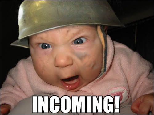
Anther popular internet meme is the Funny Photoshopped Baby Face, which is simple a picture of an evil-looking baby who has been digitally given all sorts of costumes, from Hitler to Shrek.

Parents have always been entertained by their adorable offspring, but it is only recently they have gotten the chance to share these moments with the world. As long as they remain cute and helpless, babies will continue to be playthings for grown-ups. I only hope that people do not abuse their power, but allow society’s only unadulterated members to enjoy their precious pre-conscious years in peace.
Keep reading...

Friday, June 12, 2009

My First FAIL Pic


The popular YouTube star Nigahiga recently made a commercial to promote Carl's Jr's new Portobello Mushroom Burger. Too bad he spelled the name of the product wrong.... Keep reading...

Georgia Shakespeare is SENSATIONAL!


Typically, the promotional materials sent out by theater companies all look about the same: Either a stapled brochure or an accordion fold-out, with a list of dates and performances. Yet a local Atlanta theater company at Oglethorpe University called Georgia Shakespeare decided to buck the status quo and do something different.

Their 2009 season announcement is written and designed like a cheesy tabloid, which certainly got my attention and made me read. I’m really impressed they pulled something like this off, especially in this economy. Cheers to GS. Keep reading...

Thursday, May 21, 2009

Coke Could Also Use Better Advertising


Didn't mean to hate on Coke in two posts in a row, but that's how fate would have it. (It also seems critiquing bus shelter advertising is becoming a trend for me...can't wait to do the medium some justice when I get out in the real world!)

Anyway, today's unfortunate example is currently running in Atlanta, and presumably across the country, to support Coke's Secret Formula campaign. Having worked on a piece of the campaign myself I can attest to the fact that the campaign has potential to be fun and interesting.

Wieden+Kennedy, one of the world's leading creative shops, was behind the original idea, though I can't be sure they oversaw the production of this piece in particular. The iffy art direction notwithstanding, the headline of this ad is atrocious. It is tautologous nonsense, and adds absolutely zero to the big idea. Just because the ads are supposed to look amateur doesn't mean the writing should be. Keep reading...

Thursday, April 30, 2009

Marshalls Gets New Media


Marshalls is not a brand I typically consider hip or web-savvy, but their newest promotion shows that someone there gets it. To promote The Cube, a new mini-boutique for girls within some Marshalls stores, the company is using as its spokesperson someone who is neither female nor even real.

Kelly, a character created by comedian Liam Sullivan, is the star of many YouTube videos, most notably "Shoes," which is one of the most quoted viral videos among teens. The latest one takes place primarily in a Marshalls store, but the viewer is not hit over the head with the brand; in fact, only by reading the details of the video did I figure out the sponsorship.

This campaign is remarkable for several reasons. One, it shows companies are willing to take risks by using "internet celebrities" as spokespeople. Two, it shows they are willing to take this step in spite of vulgar language and possibly controversial imagery in the Kelly videos. Three, it shows a fantastic integration of social media and real world applications.

It's awesome to see boring brands taking risks like this, and exciting to see where advertising is heading. Keep reading...

Friday, April 17, 2009

Advertising Atrocity


Quite possibly one of the oddest success stories in advertising, the epileptic banner ad continues to be a mainstay in online campaigns for various mundane services, such as car insurance and mortgage companies. Its first, and most famous, incarnation was the dancing silhouettes used by LowerMyBills.com that were virtually ubiquitous (pun intended) for several years. Recently a smaller, yet no less optically painful example of this form of advertising has popped up on weather.com. If you haven’t seen it, it shows two women gyrating jerkily, a telltale sign of an animated GIF file. One of the women, dressed in Midwest-modest attire, shakes her rear enthusiastically, as if dancing to some unheard bass-heavy beat. The other woman, smiling, does a lame “raise-the-roof” motion. Somehow this combination is supposed to incite me to check my car insurance. Huh? Someone please end this abomination of advertising. Keep reading...

Thursday, April 16, 2009

Audi Commercials Offend Me


I caught this commercial during The Office tonight, and was quite turned off by the message it seemed to send. The spot shows a bunch of children emerging from their school, only to be confronted by an endless line of champagne-colored Lexus SUVs. "Identity theft affects everyone," the spot says. The confusing copy notwithstanding, I find the premise of the spot completely unappealing. True, Lexus RX300 SUVs are quite popular among a certain upper middle class demographic. But to market the Audi Q5 solely to snobby private school parents seems pretentious at best and offensive at worst.

It reminded me of another Audi commercial, below, that I also found in bad taste. This one shows a house changing through time, and ends with the tag "Progress is Beautiful," implying that antiques and retro design are not beautiful. I, as well as many interior designers and style mavens would have to disagree.


Though I dislike Audi advertising, I do very much like the headlights on the new A4. Very very cool.

Keep reading...

Tuesday, January 13, 2009

Cool Internet Things

Recently I've enjoyed two very different sites online:

Durchzug.info is a collection of hundreds of German/Swiss/Austrian Bahn (train) announcements. As a Europhile and someone who is eager to return to the land of pretzels and beer houses, I loved how easy it was to close my eyes and imagine myself pulling up to Berlin Hauptbahnhof. Whoever put all the time and effort into compiling this collection, thank you!

Description

This site is much more well known. Sponsored by Burger King (and produced by the bete noire of advertising, CPB), Whopper Sacrifice is a Facebook application with a simple premise: defriend 10 of your "friends," and get a coupon for a free Whopper. It's funny, it's viral, and it's a great use of social networks. Keep reading...

Sunday, October 19, 2008

Finally, Another Cool Advertising Post


Honda turned a stretch of road in California into a musical instrument. By arranging grooves on the road in a certain order and pattern, the team created a road that played the William Tell Overture as cars drove over it. Neighbors complained soon enough about the noise, but the publicity from this singular, unexpected stunt surely makes up for it

Description

This is kind of old (it won a 2008 One Show Pencil), but I'm posting it anyway. An agency called Papercut in Sweden developed a fantastic digital campaign for Doritos that breaks through all the proverbial clutter--in fact, it does away with it altogether. By downloading an application to their desktops, users are able to replace the ads on a given webpage with whatever content they want.


Description

More recently, Doritos unveiled a microsite called Hotel 626 (by Goodby) that lets visitors explore 13 rooms of a haunted hotel and solve Myst-style puzzles and challenges. What's more, it's only open from 6pm-6am EST, to ensure people experience it in the proper mood. Keep reading...

Tuesday, September 2, 2008

Golden Moon Hotel & Casino Sucks


Several weeks ago I heard a radio spot for a place called Golden Moon Hotel & Casino. It consisted of a conversation between two men discussing their plans to visit said casino, using expressions that reeked of douchebagginess (sample line of dialog: “Blonde, brunette, it doesn’t matter!”). Their conversation made me, as a copywriter, a man, and a human being, want to drive my car into a wall. They sounded like parodies of douchebags, only they were completely serious. The phrase that made me wince most, however, was “You know,” said by both characters with different intonation. It seemed like the copywriters were desperately trying to hint at debauchery, but couldn’t figure out some creative way to do so. Little did I know these two empty words were the crux of Golden Moon’s advertising strategy.

Last week the casino rolled out print ads and billboards featuring the abominable phrase, along with a picture of a semi-attractive woman emerging from a swimming pool. Beneath the photo, the despised words. WHAT DO THEY MEAN? What am I alleged to know? Because I most certainly DO NOT KNOW.

The second ad is equally awful, but for altogether different reasons. The headline makes no sense, unless you understand the pun on “moon.” It is also set lazily in all caps with a pointless drop shadow. The body copy is full of empty words and clichéd phrases. Then there’s the mammoth (boring) logo. Complete ad fail.

Golden Moon Hotel & Casino, I’m sorry, but I hate you. Keep reading...

Friday, May 23, 2008

Brand Timeline Portrait

Brand Portrait Timeline

Just the kind of thing an ad geek/life chronicler such as myself wishes I'd thought of. Amazing that consumer culture has advanced to the point where we can communicate the events of our day using only brand logos. Each logo conveys not just a specific activity, but also psychographic details about the personality and socioeconomic class of their user. Very cool. Keep reading...